Ecommerce integrations
Brief one line explanation.
Overview
The ‘Connect’ eCommerce integration platform needed to be brought in-house, with the project including the opportunity to re-architect and refresh the design.
I was part of the initial phases of the project to redesign the integrations settings screens for Shippit’s largest integration partner.
Background
Shippit is a Sydney-based platform for eCommerce retailers. Powering delivery, providing access to multiple carriers, streamlining the shipping management process and saving time and money.
The existing Connect integration software was built and managed externally. Processes contained increasingly complicated manual configuration, usability suffered and documentation was lacking.
The challenge
Lift, shift, re-architect, refresh
The goal for the project was to bring the integration software in-house to improve the architecture and design, reduce risk and improve scalability.
This was to be a 3-phase endeavour:
Rebuild the software in a new microservices environment, reproduce core features, refresh the UI design and information architecture, introduce analytics.
Achieve feature parity, enhance design and relocate one feature out of the settings environment.
Redesign to reduce/eliminate support required for manual configuration, target problem features and flows identified by analytics.
My role
As product designer, I designed the integrations settings screens as well as the onboarding flow that utilised a number of integrations steps. I conducted preliminary research on onboarding flow experience and worked alongside a product manager, technical lead and a team of front and back-end engineers.
I worked on the project from its inception in September 2021 until mid-phase 2 of the project in March 2022. The phase 1 designs and features were built, completed QA and had commenced preparations for a staged roll-out to customers.
Constraints
The existing designs of the whole Shippit platform were to be upgraded incrementally, as each feature set was moved out of the old ‘monolithic’ environment.
This was the second overall project to change the look and feel of the features, and the first from the settings group. The new integrations designs were to resemble the existing settings, to maintain some degree of consistency when navigating between the new and old pages.
The new designs needed to utilise existing components from the fledgling design system wherever possible.
The initial phases of the project were to retain the existing feature capabilities, so re-designs were limited in innovation.


The process
Discovery & analysis
A lack of documentation required numerous internal discovery sessions with the project squad and partner SME’s.
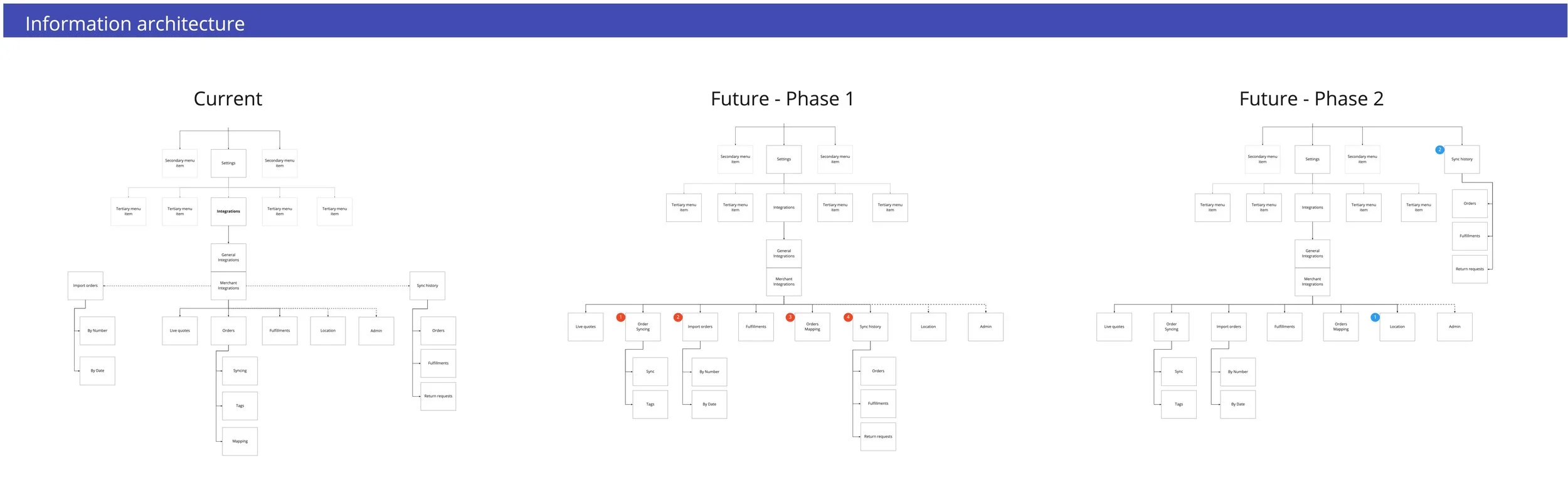
To assist with the squad’s understanding of the integration onboarding process and to aid redesign, I constructed user AS-IS and TO-BE flow maps.
Navigation and information architecture were simplified into a flatter, more visible structure to aid discoverability of feature controls. I laid this architecture into a number of simple tree-structure site maps based on the existing and future versions based on the phases of the project.
Existing screens were heuristically evaluated and potential usability issues identified. I built a limited number of wireframes to aid layout and architecture visualisation.
Research
Very little analytics data was available on the integrations onboarding flow, and none on the in-app integrations settings.
Later phases of the project involved putting some analytics trackers and measures in place but initially, the only measures we had were:
just over 30% of the users who downloaded the Shippit app to their Shopify store went on to become Shippit subscribers. In addition,
just over 20% of Shopify users who downloaded the Shippit app for their store - would uninstall the app within 14 days, with 15% uninstalling that same day.
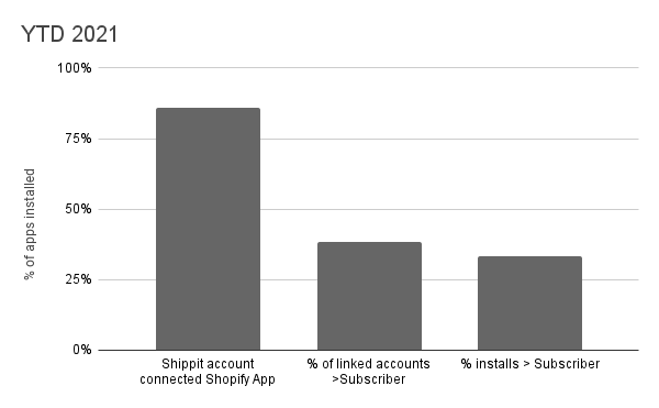

Could there be something in the flow that was a problem for users?
I conducted rudimentary user research with customers who had recently experienced the onboarding flow. This research consisted of phone conversations centered on:
their onboarding flow experience,
their success with integrating the Shippit app with their Shopify store,
if they felt they required any further information to connect the apps
(if applicable) their reason for uninstalling the Shippit app.
Results of these discussions (15) revealed:
Only one user had integration difficulty with the onboarding process that required support assistance, but 5 users were unsure on what other integration settings were available and where they could be found.
A larger than expected number (6/15) of users had installed the app in order to further investigate and compare the shipping rates and handling capability of large/bulky items. They uninstalled the app after these questions had been answered.
Implications:
Increased user assistance may be required in the form of clearer and more educational copy, tooltips, additional settings and links to help articles.
Install-to-compare behaviour was passed on to heads of product and marketing to investigate whether any information and assistance could be provided to users earlier in their purchase journey.
Design
Navigation & Information architecture
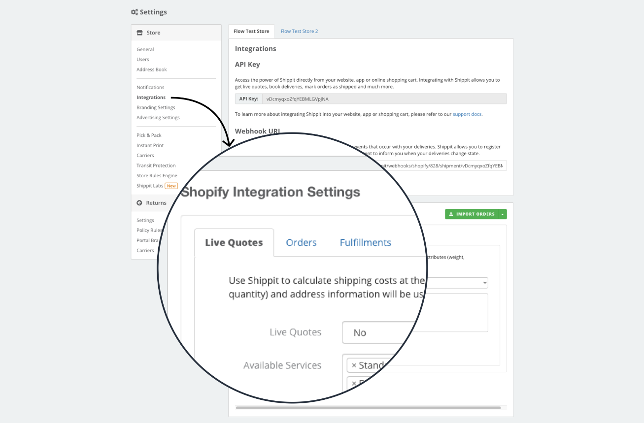
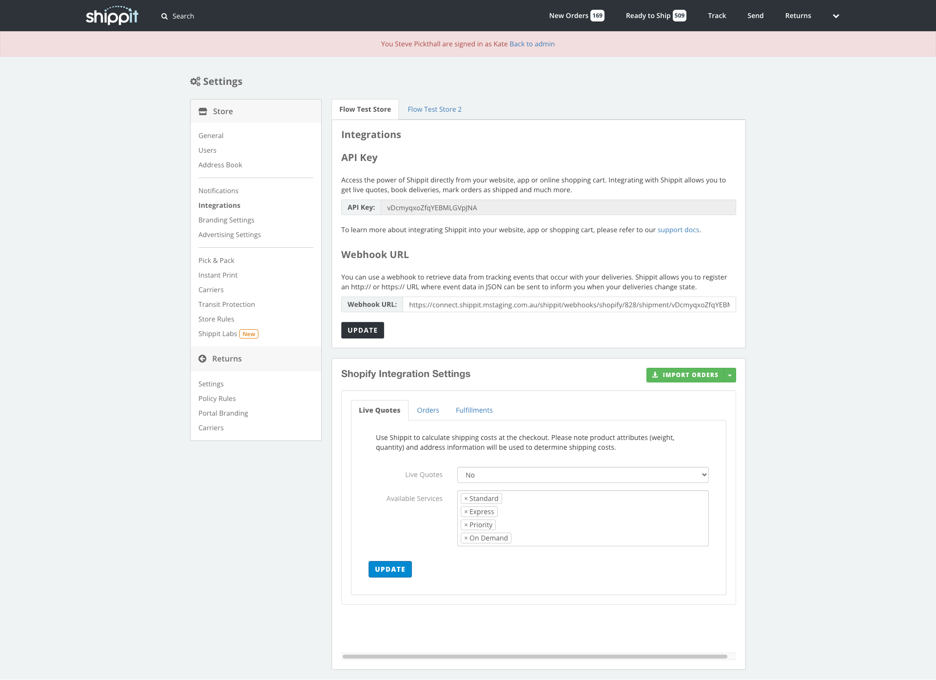
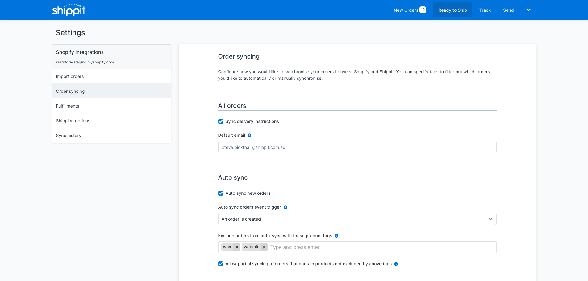
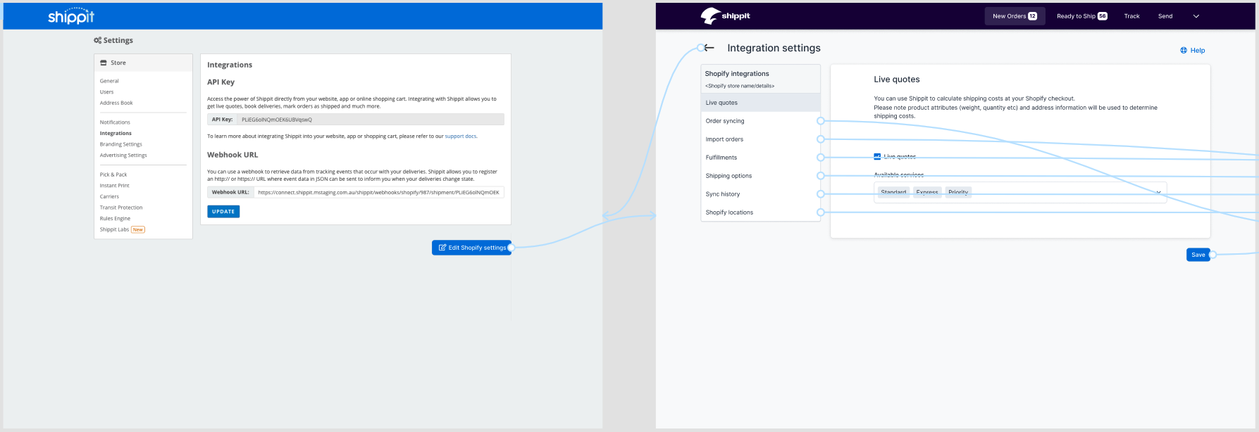
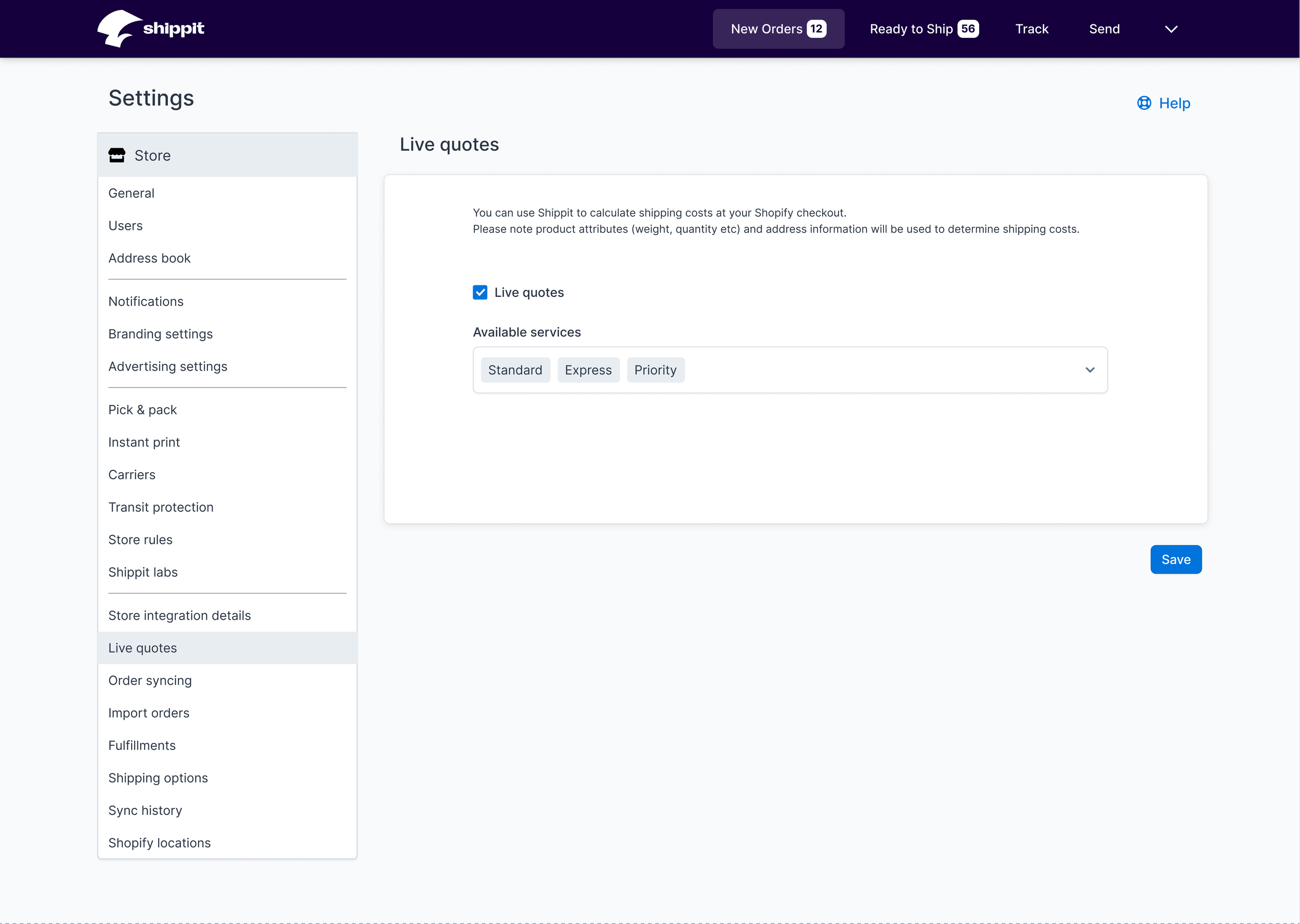
The existing viewing experience was not optimal: a small iframe housed the integrations settings within Shippit, and for those users who preferred to access Shippit from within their Shopify store - this was viewed within another iframe. In addition, it utilised display patterns inconsistent with the rest of the app, and confusing for the user.
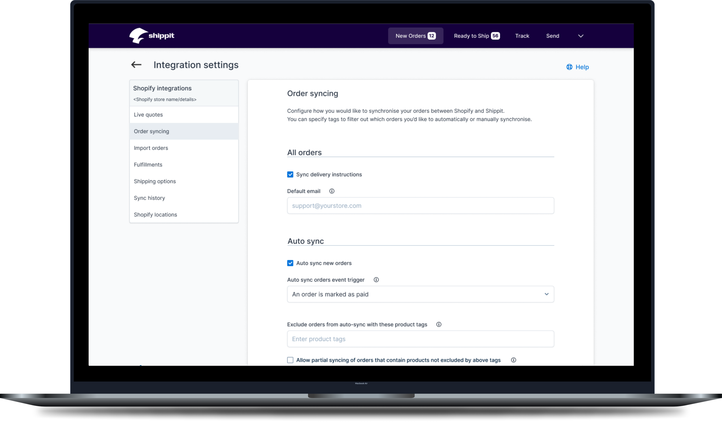
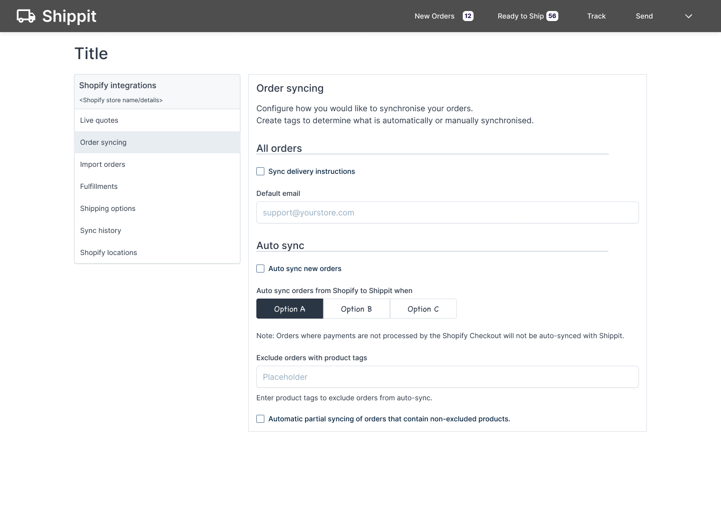
The redesigned pages were separated from the remaining settings and given an individual sub-menu page, with links back to the central settings pages and the main application features. Pages retained the look and feel of the existing navigation and the display of information in large cards, with a single Update/Save CTA for changes.
The information architecture was flattened to make it easier to navigate and discover.
During QA, we felt that the separation of the 2 nav types would lead to unease and confusion for users. We decided to expand the new navigation to include all items from the old one - so users could navigate directly form the old to the new and back again without disorientation.
Frame and screen layout
Interestingly, responsive screens to accomodate mobile devices were not a requirement as nearly all Shippit’s customers use a desktop device for a number of reasons. Desktop screens with limited responsivity were built with a widened frame to match the first of Shippit’s screens to recently undergo a design refresh. This gave added space for side-by-side mapping designs and an expanded table.
Components used were limited to the fledgling design system that had been constructed for a recent refresh project. While this did limit the designs a little, the benefits of reduced engineering work and reduced time to market outweighed this.

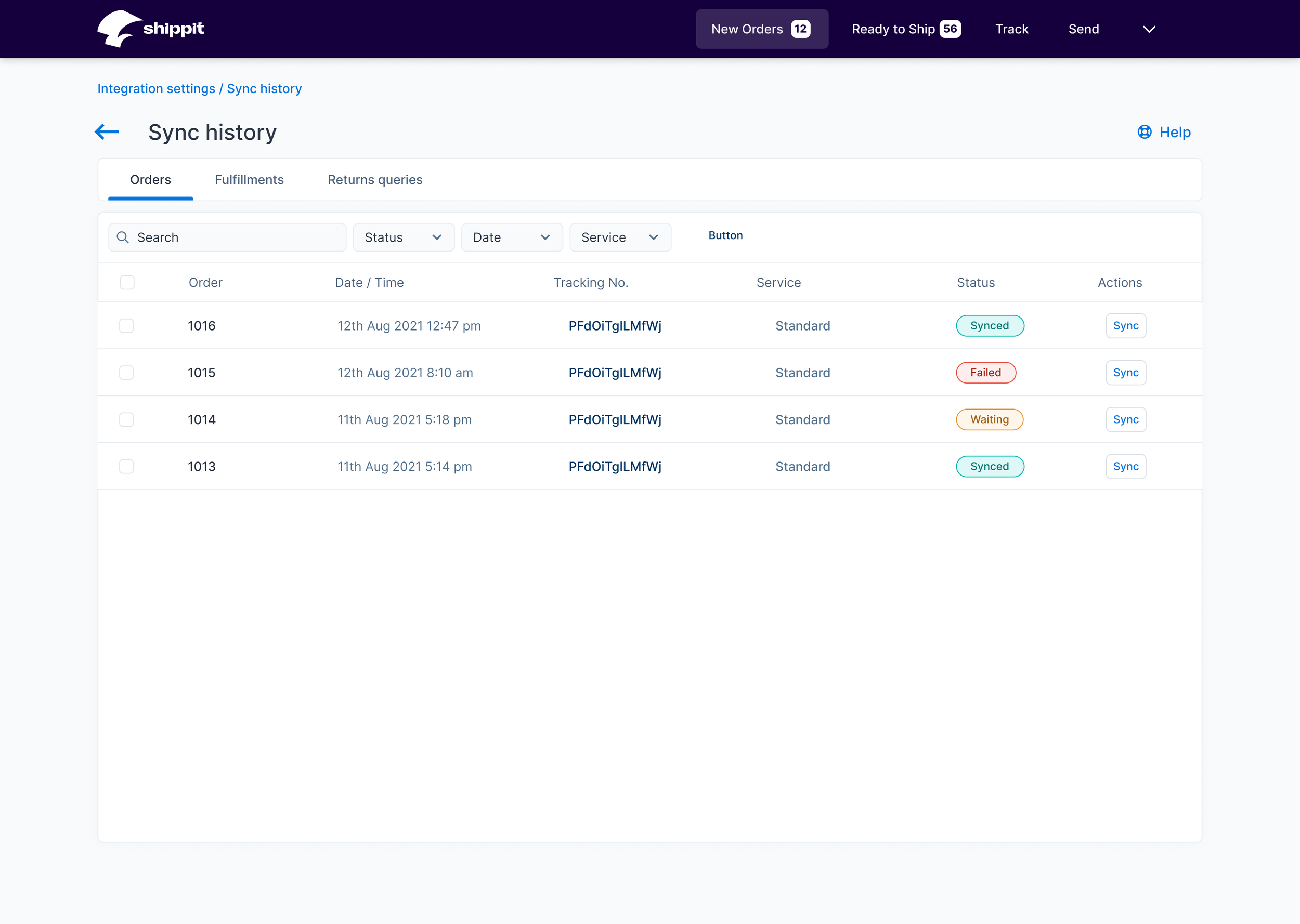
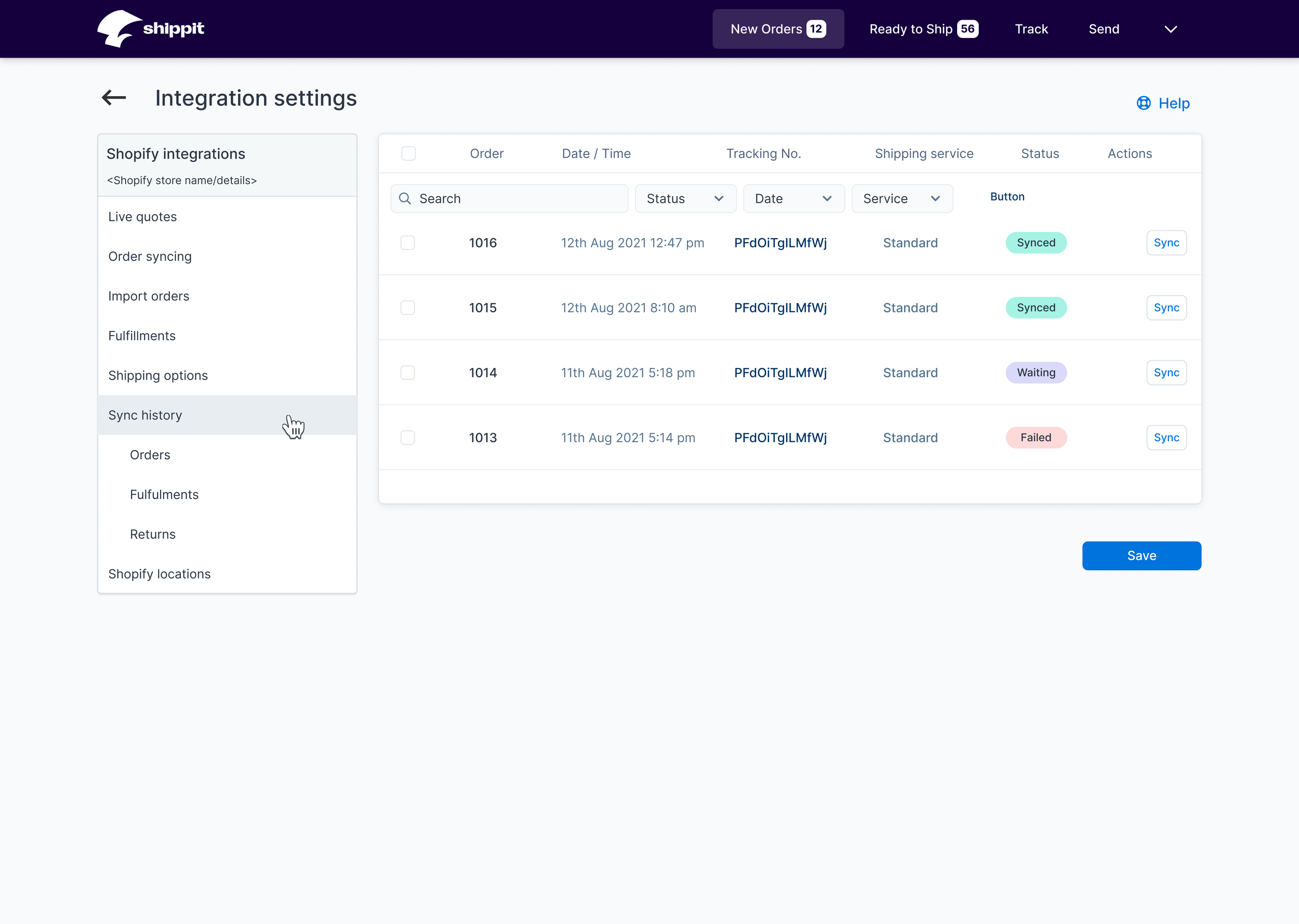
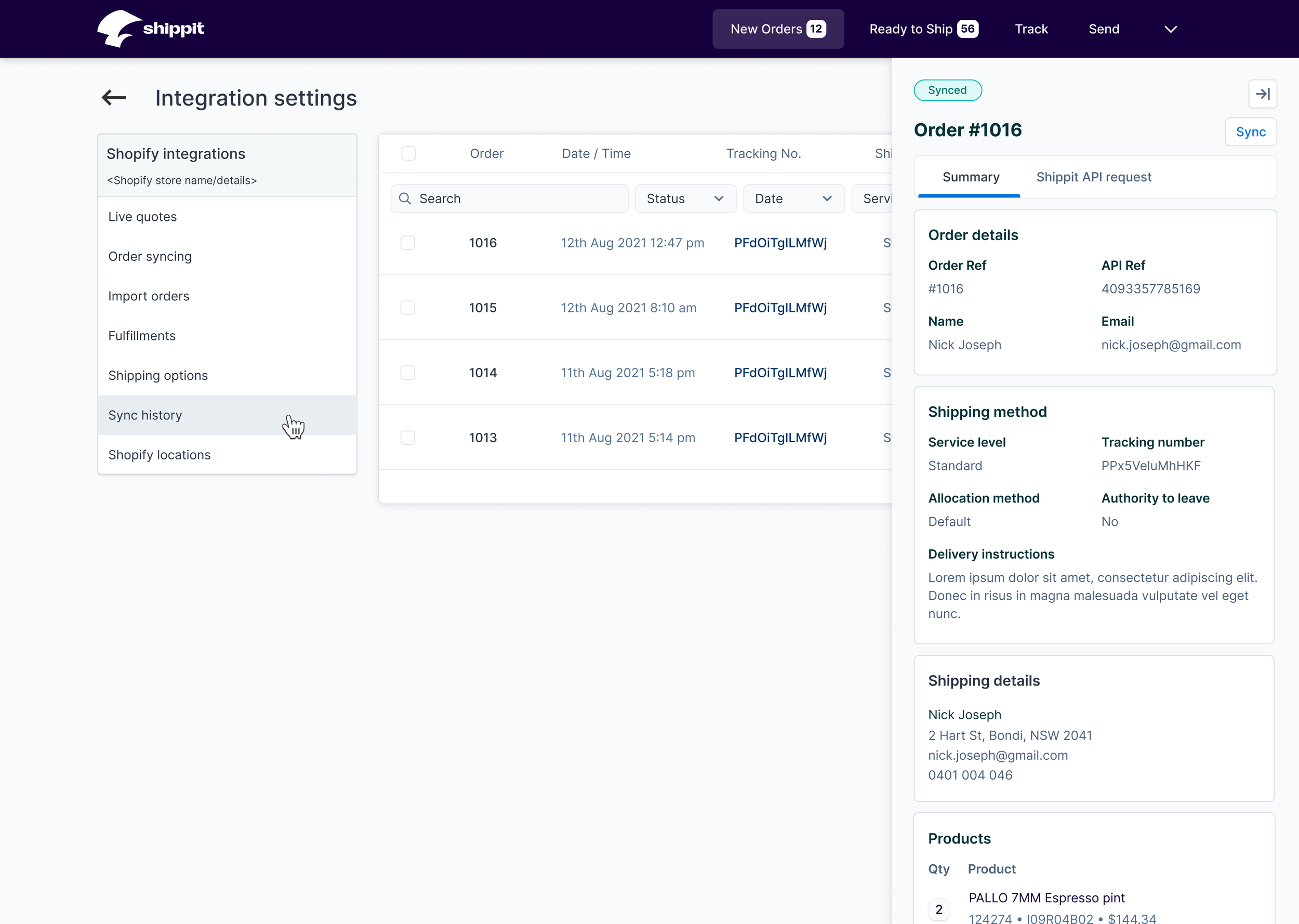
Sync history table
An existing orders table was redesigned to align with another recently refreshed table (orders), however the details display pattern for the orders table was undergoing reconsideration following some negative feedback.
In collaboration with Shippit’s other product designers, we settled on displaying the details of the sync in a side sheet/drawer.
Original designs removed the left sided nav in favour of a minimalistic breadcrumb, this allowed the table to expand to the full width of the frame, which we thought was required due to the presence of the right-sided drawer obscuring the table when displayed.
In combination with the expansion of the nav panel, the designs were updated to replace the nav panel on the sync table page, as enough of the underlying table was visible for orientation and selection.

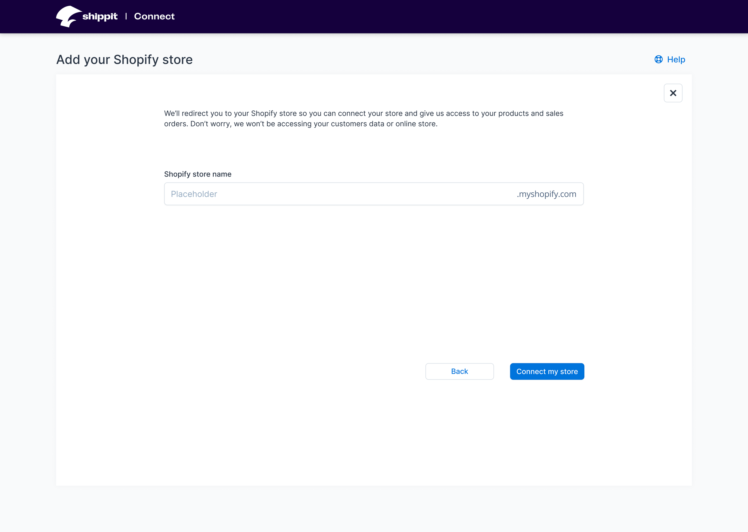
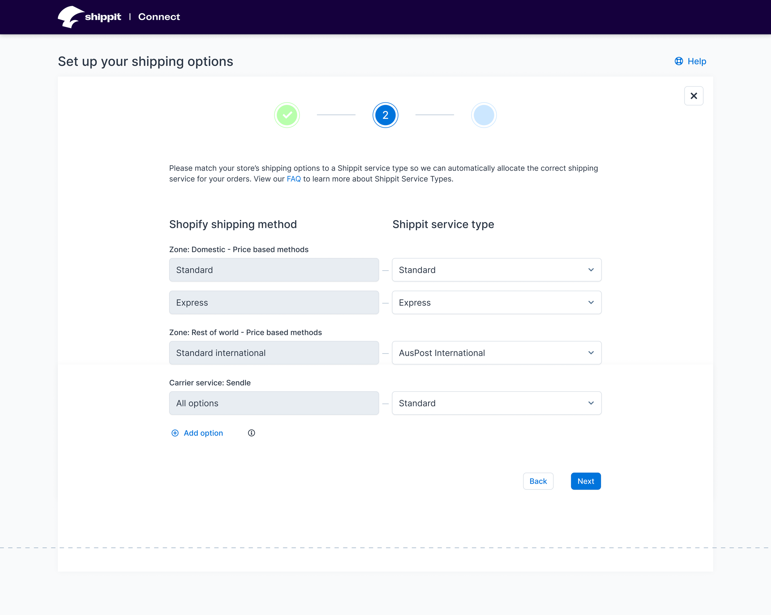
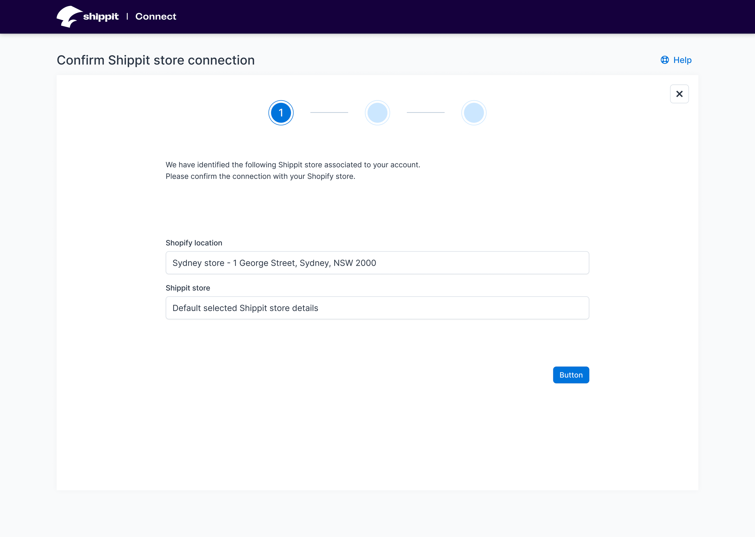
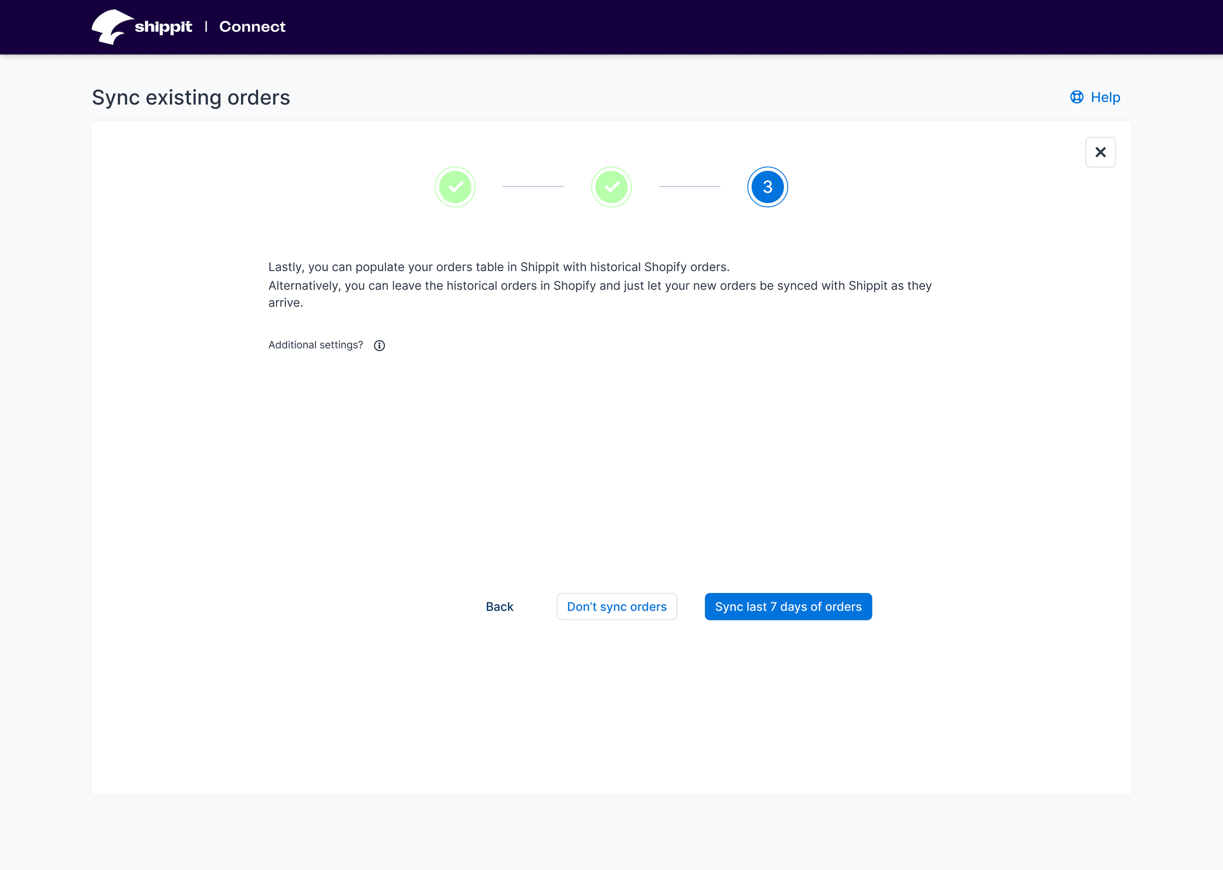
Onboarding flow
The existing integration screens in the app installation onboarding flow delivered a sub-standard user experience and could contribute to confusion.
The one, occasionally two screens were split into three permanent screens in a wizard format in order to provide clearer messages and greater educational assistance.
Learnings
The Playbook
Much of the company’s new design system was not documented. With three product designers involved with multiple projects each, the potential for malalignment was large.
I would push for greater clarity on those unwritten display patterns and design directions. Even just solidifying an overall vision in sketch or wireframe form would improve design consistency and reduce re-work to improve alignment in the future.
Back to basics
Performing even rudimentary, direct user research and early-design testing to investigate potential problems and validate assumptions is always valuable.
We did one, but not the other.
Researched helped guide our screens and content of the onboarding flow. Testing would have helped the initial navigation design and reduce additional work during QA.
Show value fast
Based on some of my research, it was tempting to include additional steps in the onboarding flow to improve the integration and setup between the 2 platforms. However our analytics showed a large drop-off in user conversion.
Realising that there was greater benefit in getting the user to see the value of the Shippit service, than customise the platform integration was an important step.
While some additional screens were added to the onboarding flow, no new functionality was introduced and improvements in educational copy and assistive features were implemented. The goal here was not to hold the user back from creating and fulfilling orders, which was where Shippit’s value existed.