Customer portal
Retirement funds self-service portal.

Overview
The Challenger customer platform was in need of an upgrade in order for its use to be expanded from Financial Advisers to include direct investors.
I was the designer for the latter stages of the project, expanding on the mid fidelity wireframes and turning them into development ready screens and performing QA on completed work.

Background
Challenger is a Sydney-based investment management company providing customers with financial security for retirement.
The company responded to market changes and began attracting and interacting with investors directly, in addition to the traditional financial advisor channel.
The challenge
Engage with our end customers
The goal of this project was to modernise the UI for use across multiple devices and to simplify the architecture and designs for use by Challengers aged demographic.
This was the first of a multi-stage uplift: build the new platform with capability for consumption initially (view existing investments), then expand to include customer driven changes including information updates, changes to investments and new investment creation.
My role
I joined the Digital Technology Services Team as a Digital UX Business Analyst and took on the design duties for this project after the initial phases were complete – resulting in mid fidelity screen designs that covered the central functions in user flows.
I structured the information architecture, designed additional screens to satisfy all requirements, reviewed existing designs and made changes where necessary, increased fidelity of designs and made them compatible with the existing design system and CMS components, and conducted QA on developed screens.
Constraints
The handed-over wires were already signed off by the main stakeholders so any design changes could not deviate too far from the agreed look. The goal was to create a distinct but related look and feel to existing pages customers were familiar with.
Where possible, existing components were to be used in order to minimise new development work.
Design for new components required consideration of integration into the company’s CMS for easier maintenance and publishing.
The process
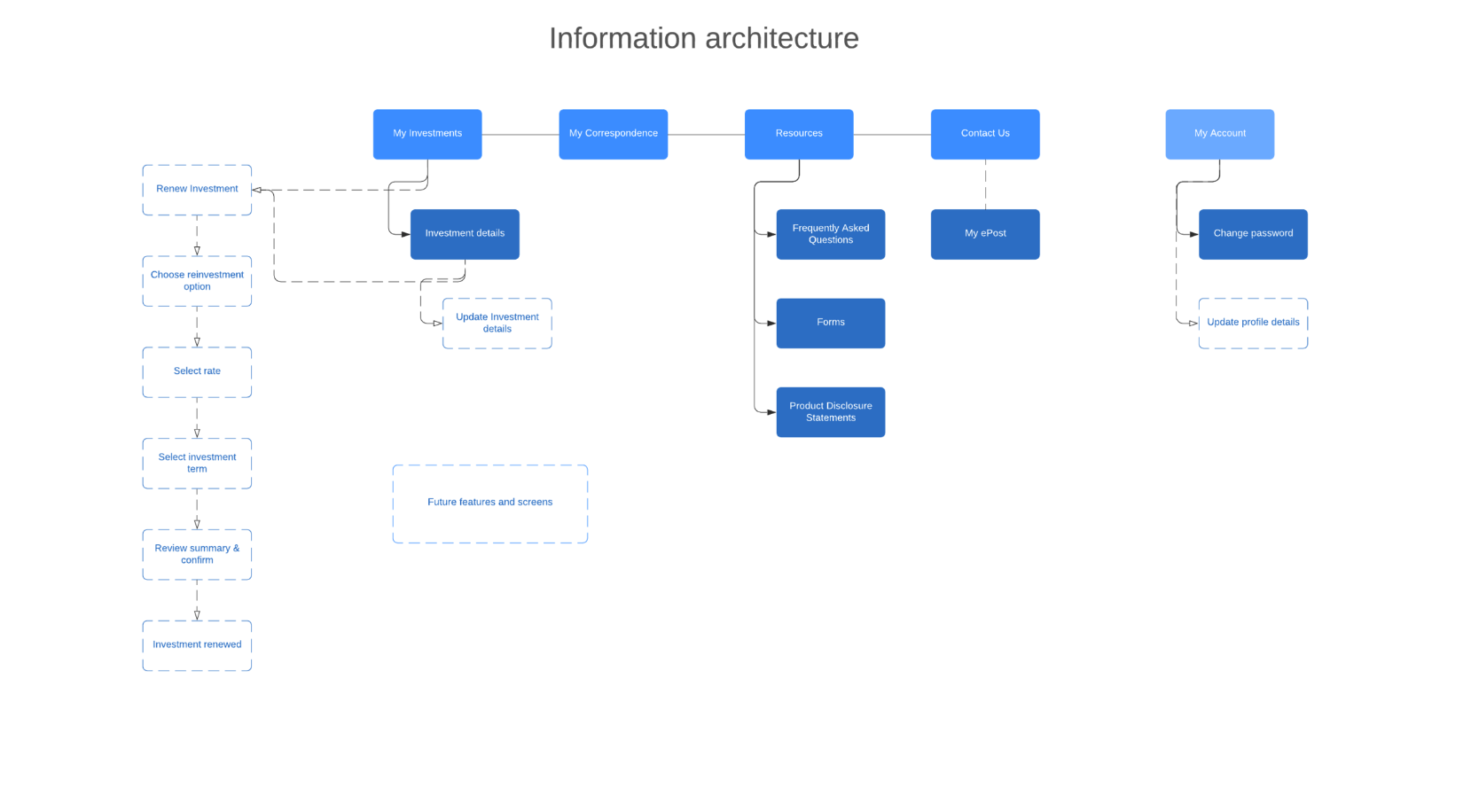
Information Architecture
Card sorting exercise with suitable target audience validated architecture assumptions on profile and settings pages, and design for future reinvestment capabilities.
Additional screens and components
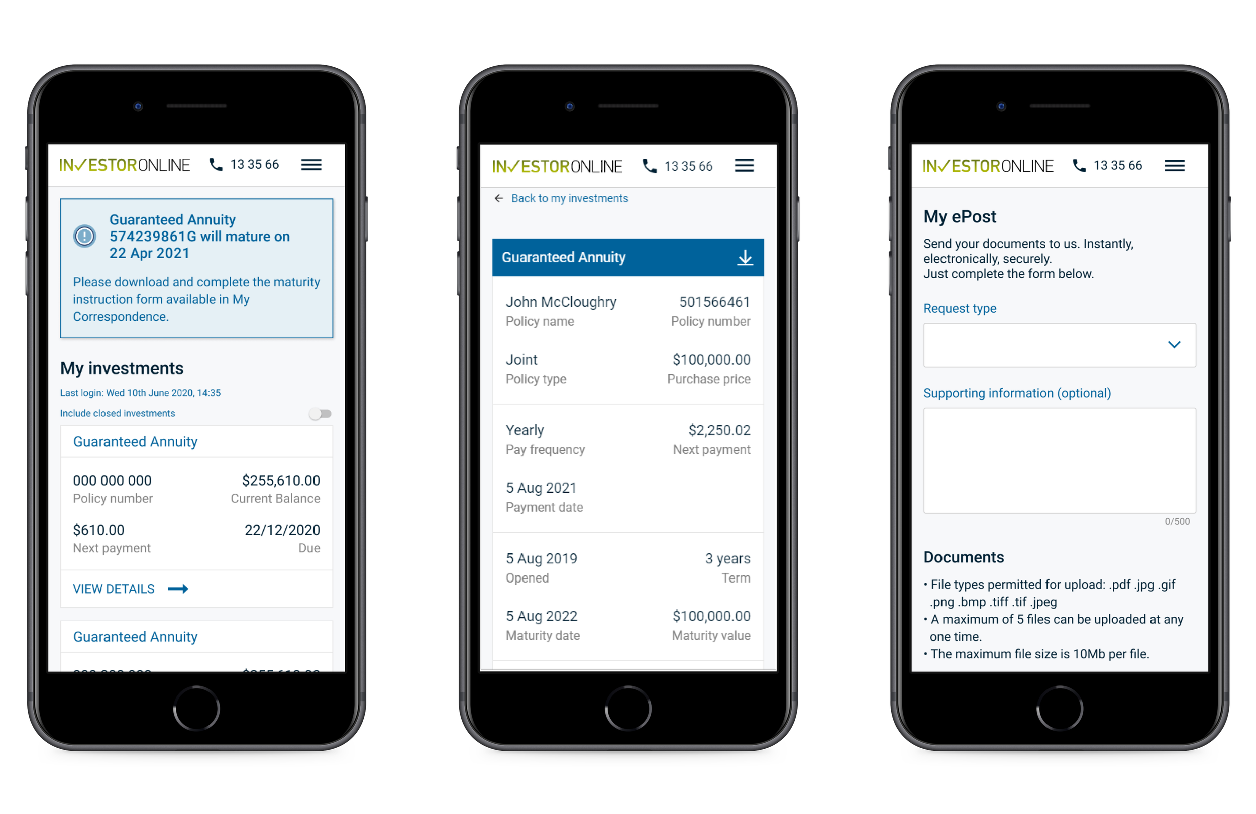
I designed additional screens including Login, profile and details, and settings/preferences to fill out the user flows and complete the experience. In addition to screens, I designed banner and notification components.
Adjustments
I detected an issue with the small spaces initially allowed for the display of transaction and balance amounts, I then changed the layouts of numerical displays on all devices to accommodate the larger numbers required.
Some colours required a change to fit in with the Challenger approved colour palette, as well as complying with AA web accessibility standards.
General padding and spacing changed were required to fit in with the design system and existing grid layouts.
Post design
I performed QA on developed screens as well as writing all the JIRA stories for migration of the components and pages into the Sitecore CMS.
Learnings
1. Review completed work for thoroughness, accuracy and fit within established paradigms.
Even though the initial work was completed by an external agency, it still needed some work for it to fit within Challenger’s requirements for brand, interactions and ability to work within their existing CMS.
2. Keep customer demographic characteristics (in this case an aged demographic) in the front of your mind to maintain consistency and appropriateness of designs for the target audience.
With so much financial data to be presented to the user, it was tempting to reduce font size and whitespace to fit more information per page. Keeping it simple and lengthening the page or flowing onto a new page was preferred.
3. Prior to wireframes, have an accurate view of what data is expected to be displayed through API integrations.
Initial designs used small scale values (eg: $346.00) as placeholders for API data. I reviewed the database and found values with a maximum of 12 digits in length (eg: $231,565,711,208.00). If I didn’t alter the designs to accommodate these figures they would have broken the layout on desktop and more-so on mobile.
4. Maintain a close relationship between designs and corresponding tickets to ensure all interactions and states are accurately portrayed to developers.
Start with a discussion with the Developer to see what components and libraries they are using and might be restricted to, this way you can use familiar components to cut down work.
Review designs with the Product Owner to make sure they achieve the business goals.
Discuss the designs with the BA and review tickets to make sure your message (screens, components, and interactions) will be received clearly by the Developer.
Review completed components and screens with the Developer prior to testing.